How I Made This: Hausu (House) Film Poster
One of the first film posters I ever made back in 2020 was based on an idea I had for Hausu, the 1977 film directed by Nobuhiko Obayashi. The film is wildly fantastical with a horrific fairytale-esque atmosphere. In short, it’s all the things I love. Plus, the film makes use of bright colors, like its cotton-candy skies and psychedelic effects, making it perfect for film poster source material.

Everything is magical, from the sets to the effects.
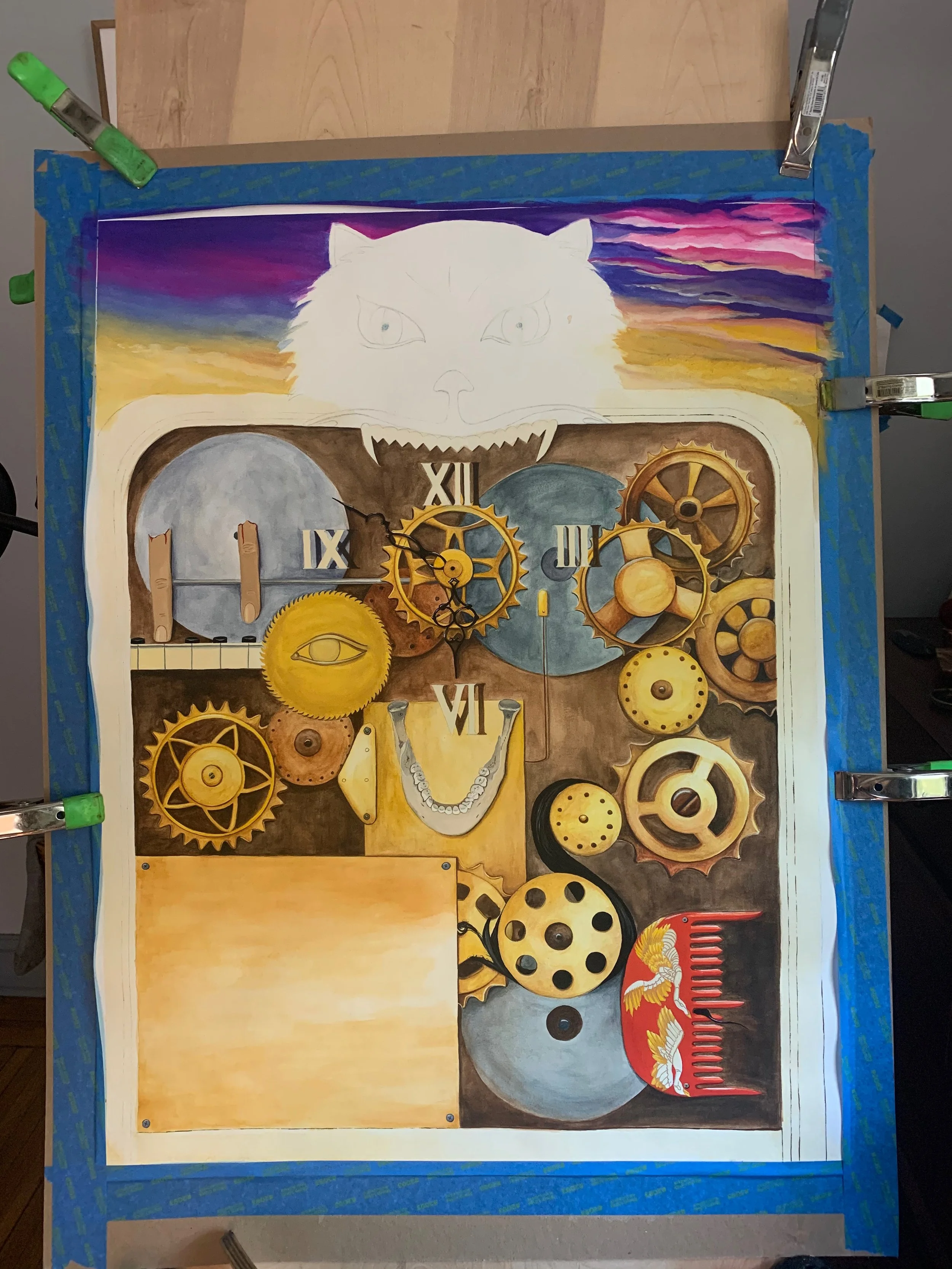
The premise (to me anyway) was that the house could be seen as a gigantic mechanical death machine—a clock—which murders the visiting girls one by one in uniquely different ways. I wanted to draw that contraption as the poster, while making use of the iconic cat (or shapeshifting witch) as the “head” of this contraption. The letters in “House” would represent different ways in which the girls die. The difficulty would be in adding credits, which, in hindsight, I probably didn’t need. But at the time I thought if I could leave a large metal plate open for the text, this would leave plenty of room.

Different death symbols: Fingers on a piano, A removed jawbone, Hair getting stuck in a gear, and Death by vanity comb, spelling out “House”.
For the sketch I pulled a lot of references for old clocks, bones, and Japanese combs, creating a collage of sorts and then drew them on a diagonal. Why a diagonal? To create movement: film posters need movement in order to help the eye travel. I learned this from Ellen Lupton in her fantastic “Demystifying Poster Design” course.
Once I was satisfied with my sketch, I began painting. I decided on watercolor for most of the background and gouache for the letters, so as to make them stand out a bit more. The most difficult part was keeping my watercolor bead going for an even wash over the background. But then I realized I would be glazing shadows anyway, so the even-ness could be cheated with additional glazes.

Keeping the color saturation darker where I would incorporate shadows helped me to not lose my cool over creating “even” washes of watercolor.
I used masking fluid to keep the white paper in some places, but it ended up leaving residue in the end (because this 24x32” piece took months!). Thank goodness for white gouache, which was a part of the piece anyway and I could fix any blue tinges left behind with that.

Close-up of how it came along—background washes in watercolor with opaque, prominent objects, like the bright red comb, in gouache.
At 24x32”, this piece took up a lot of space.

An almost-finished photo—all that’s left is the wooden detailing running down the border and it’s off to Photoshop.
One of the hardest lessons I had to learn was to let this piece be whenever it was giving me trouble. You can notice it in the previous process shot: the sky was looking too cartoonish on the right. It took some scrubbing away of paint, which almost took the paper with it! But I took breaks, gave it a rest and finally got to a gradient I was happy with.

The final poster with added embossed text, done in Photoshop
While the final poster came out looking a bit more chaotic than I’d thought, that is the true essence of this film. There is so much going on! But I like it, it’s a very niche film for people with niche tastes and I feel like I played to them well.